Deciding on a React Component Library
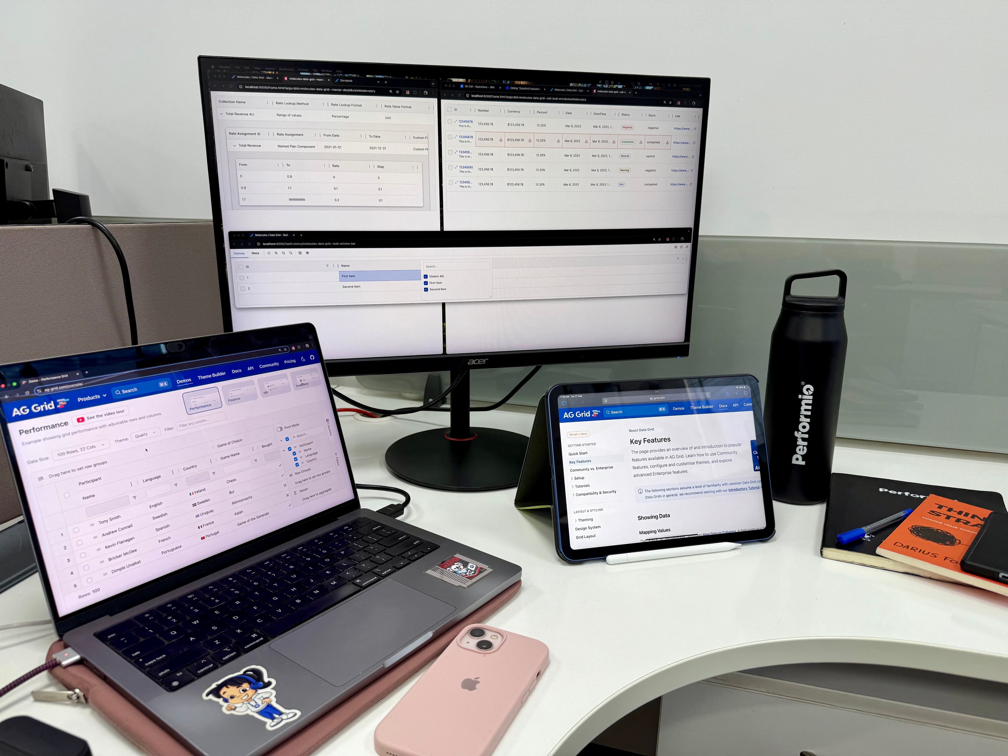
One of the exciting new projects we’re currently working on at Performio is our design system, Electric.
The primary goal for this project is to decrease the time to market on new development, so from an engineering perspective, we have decided that we would use an existing component library as a base to build from, specifically: Chakra UI.
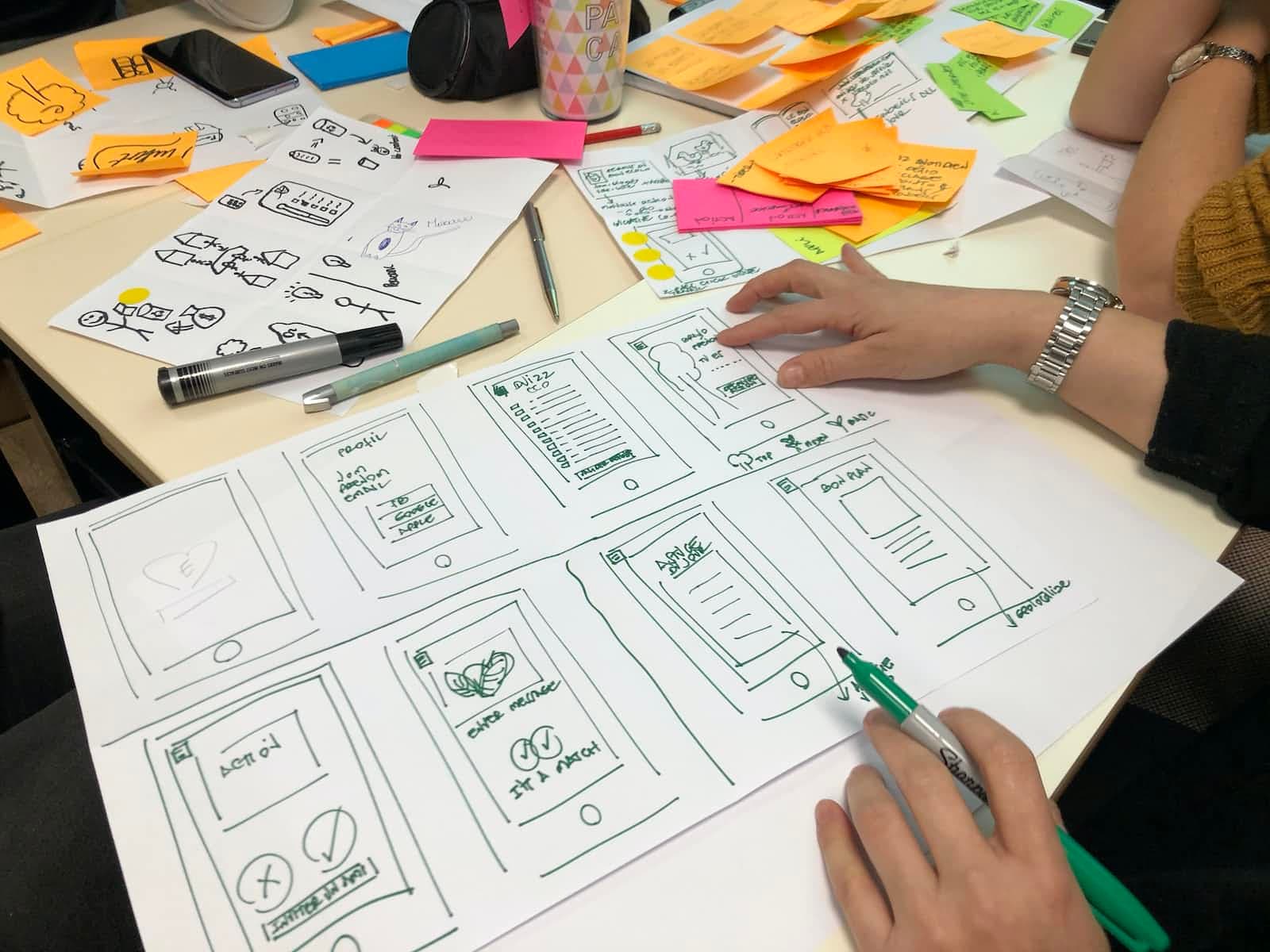
Deciding on which component library to use was complex; it had to be capable of meeting the designers' vision, meet expectations when it comes to accessibility, needed to be well documented, actively maintained, quick to provide value and the vendor had to be reliable from a longevity perspective. Over a few iterations of discovery, we found a process that supported making a final decision.
Step 1. Create a list of contenders
Our list was derived from the extensive experience of our design team, coupled with research on current market leaders based on adoption. The list was:
Step 2. Define judgement criteria
Designed to be rated from 1 to 5 (1 being scored low, and 5 being scored high), these criteria were comprised of:
Definition: A short, clear description in the common language of what defines the criteria.
Weighting: An indicator of importance to the overall decision.
Deal Breakers: Indicators that the component library should be automatically disqualified.
Rating Definition: Descriptions of what constitutes a 1, 3 and 5 score.
Given that each discipline in the team had different requirements, we decided that design and engineering would define their own criteria and be each given 5 points to apportion for weighting.
As an example, the complete definition of one of our criteria, Documentation and Support, was:
Documentation and Support | |
Definition | How well-documented is the design system? Does it have clear, thorough documentation/readmes? Is there a clear process for asking its developers/maintainers questions, and are those questions usually answered in a timely manner? |
Weighting | 1 |
Deal Breakers | 1. Less than 50% of the documentation is in English. |
Rating Definition | 1. Will need to consistently go to support to be able to solve issues, answer questions, and there is little to no English documentation or community engagement. |
Omitting detail for brevity, our complete list of criteria came to:
Design
Theme Quality | Can the library be globally themed? How easy is it to make changes and have them propagate through the entire library? |
Customisability | Can the library be customised? Are interaction states (hover, etc) hardcoded, or can they be overridden? |
Completeness | Does the library cover all the components we require? Does each component have all the interaction states we have identified in our designs? |
Accessibility | How well do the components meet WCAG 2.0 requirements? Are there graceful fallbacks for screen readers by default? |
Engineering
Documentation and Support | How well documented is the library? Are there clear guidelines on how to ask developers/maintainers questions? |
Code Quality | Is the library opinionated/un-opinionated? Does the source code appear to be easily extensible? |
Adoption | Is the user base significant and active? Are there any major projects utilising the library? |
Time to Value | How quick would it be to begin using the library? Can engineers leverage existing knowledge? |
Vendor Reliability | Is the vendor supported by any major brands or organisations? How long has the vendor existed for? Does the vendor have sufficient financial backing to survive in the long term? |
Step 3. Research and score
Once all criteria had been considered for each contender, we were able to calculate overall scores. Of the 5 contenders, Chakra UI and Base Web stood out on weighted average by a considerable margin so we decided to take them both to the next phase.
Step 4. Create Proof of Concept projects
An important part of this step was to define the goal of the Proof of Concept; what were we going to build, and how would we judge it.
For what we would build we decided on a cross-section of atomic and layout components from existing designs, which allowed us to investigate a broad sampling of common theme requirements such as spacing and colouring. For how we would judge it, we derived 3 weighted scorable areas from our existing judgement criteria:
Ease of Implementation (30%): Is the theme extensible, how close do properties match design expectations, was it straightforward to develop?
Completeness (30%): Were you able to complete the Proof of Concept in the allotted time?
Design Alignment (40%): How close to the provided design is the Proof of Concept, how well does it match our design principles and interaction patterns?
We discovered that although Base Web scored quite high during the research phase, it was very difficult to work within a fashion that suited us. This meant that Chakra UI was the clear standout.
Step 5. Review and rescore
With the findings from the Proof of Concept projects available, we re-scored the criteria for each contender. Chakra UI remained the obvious choice.
Step 6. Risk mitigation
As with selecting any new software library, this decision came with some attached risks. Given the fast-moving nature of design, we wanted to be prepared should the chosen component library cease to be viable in the near future. Specifically with Chakra UI we identified the risk as being relatively high when compared to some of the other contenders in our initial list. As such, we produced a document that described the perceived risks, the impact on development and strategies for mitigation, which I plan to describe in a separate blog post.
Summary
In taking a structured approach, ensuring that we were able to clearly articulate, score and test our criteria, we were able to make a reliable assessment and decision in a short amount of time. By documenting our findings we have also ensured that as our team grows, our reasoning isn’t lost, we’ve shown we’re aware of the risks we’ve taken on board and that we’re all prepared should we have to move to another library.
Plus, now that the decision has been made I am personally looking forward to working with Chakra UI and getting Electric into production!