Chromatic: Our Invisible Ally in Visual Regression Testing
The Importance of Better Visual Testing and Ongoing Enhancements

Implementing effective design reviews and visual testing can dramatically improve your development workflow and product quality. Our team recently integrated Chromatic into our Performance Centre (PC) and Electric Design System (EDS) projects to streamline the design review process and catch visual regressions before they reach production. Here's our journey and why Chromatic became an essential part of our frontend development toolkit.
The Challenge: Manual Design Reviews Don't Scale
Our design review process was becoming a bottleneck. We'd spend entire afternoons reviewing Figma designs, comparing them to our staging environments, and inevitably miss things that would show up in production.
The problems were getting worse as our team grew:
Time-Intensive Manual Reviews: We were spending 2–3 hours per week just on visual QA. People from design would open 5 different browsers, check mobile views.
Inconsistent Component Usage: Despite having a design system, components looked slightly different across our three main applications. Padding here, wrong color there – death by a thousand small issues.
Cross-Browser Issues: The "works on my machine" problem, but for browsers. Chrome looked perfect, but a customer would screenshot a completely broken layout in Firefox.
Collaboration Friction: Design feedback was scattered – some in Slack, some in GitHub comments, some in Figma. Nobody knew what was addressed and what wasn't.
Regression Nightmares: An innocent-looking CSS change would break something completely unrelated two pages away. We'd find out from customer support tickets.
Our applications required a systematic approach to visual testing and design reviews that could scale with our growing component library and team size.
Why We Went with Chromatic
Before landing on Chromatic, we explored several options — including other visual testing tools and improving our manual testing discipline. But none of those approaches scaled well, and we still found ourselves missing visual regressions or spending far too much time reviewing minor UI changes.
Chromatic made sense for us because:
We Already Had Storybook
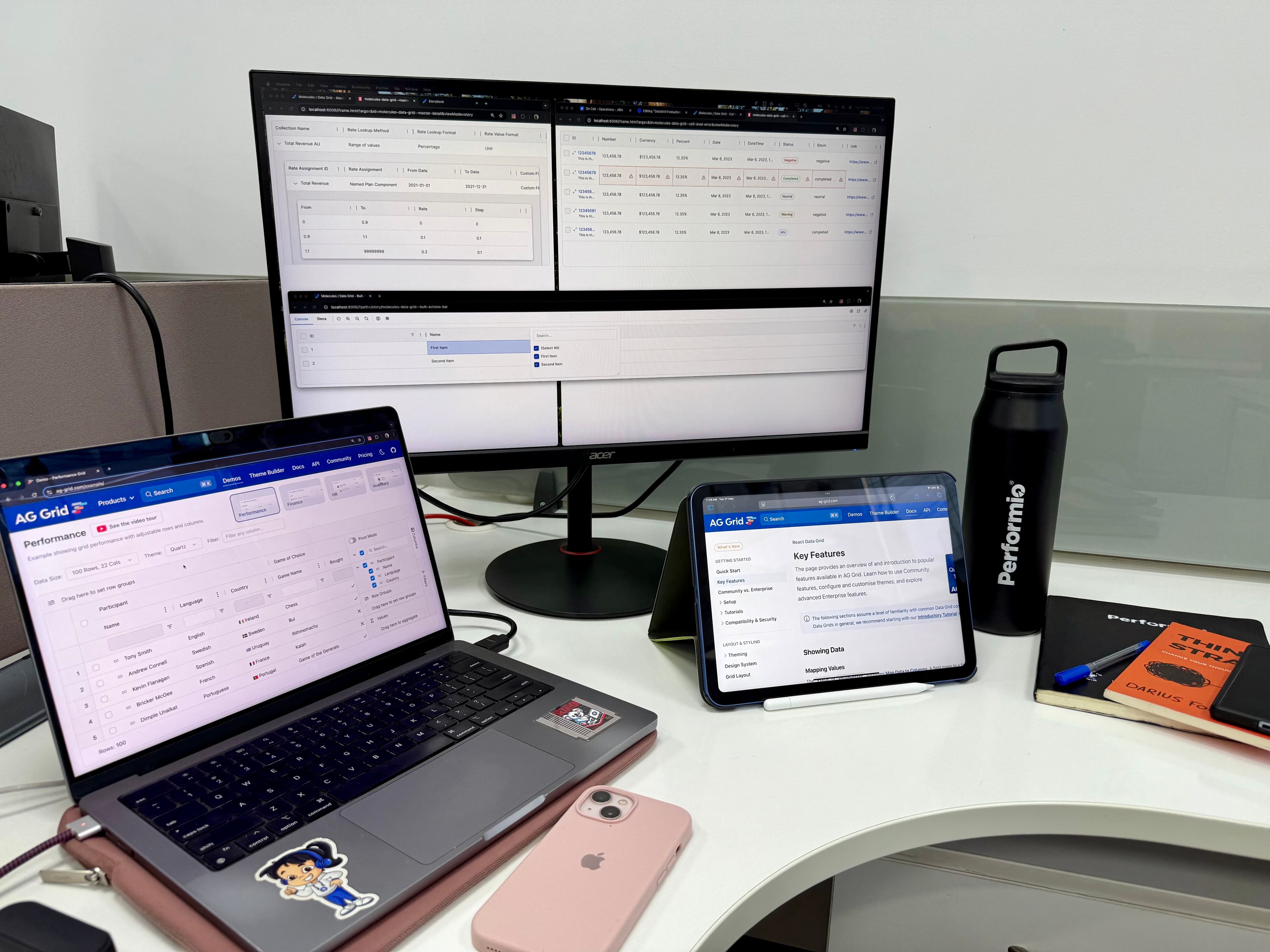
We'd invested heavily in Storybook for our component documentation. Chromatic plugged right into our existing stories without any extra work. No rewriting, no new infrastructure – it just worked with what we already had.
The Visual Diff Actually Made Sense
Unlike pixel-perfect screenshot comparisons that flagged every tiny anti-aliasing difference, Chromatic's algorithm caught real changes while ignoring the noise. We weren't drowning in false positives.

Designers Could Actually Use It
The interface was intuitive enough that our design team could review changes without needing engineering help. They could leave comments directly on visual diffs and approve changes themselves.
It Scaled with Our Team
As we added more components and more team members, Chromatic's smart diffing meant we weren't waiting hours for builds or dealing with exponentially growing test times.

Implementation Strategy: Scalable Visual Testing in Three Parts
Our integration of Chromatic wasn’t just about plugging it in and hoping for the best. We took a deliberate, two-tiered approach designed to balance visual confidence with realistic development constraints. This gave us both breadth (testing individual components) and depth (testing full user flows with real data).
1. Component-Level Testing with Storybook in Electric Design System (EDS)
We started by embedding Chromatic into our Electric Design System (EDS) – our shared component library across all frontend applications.
Why this made sense:
EDS already used Storybook heavily for documentation and development.
Most UI bugs originate at the component level, so starting here gave us quick wins.
What we did:
Created stories for each component variant (e.g., default, error, loading, success).
Defined
argsandargTypesfor dynamic controls to explore states easily.
Benefits:
Ensured foundational consistency (e.g., button styles, spacing, typography).
Visual diffs are lightweight and fast to process.
Reusable across projects with zero duplication.
2. Page-Level Testing with Real Layouts in PerformanceCenter
While component-level testing gave us coverage, real-world bugs often appear in page compositions. So we introduced page-level stories in our PerformanceCenter (PC) app.
These are not just stories — they’re full UI slices:
Dashboards with multiple filters and KPIs
User management forms
Workflow views with nested components
To test these effectively, we had to simulate realistic data and interaction flows.
3. Mock Service Workers (MSW) Integration: Testing with Real-World Data
Many of our components rely on API data. Without realistic data, our visual tests would only capture empty states or loading spinners.
What MSW Brings to Visual Testing:
MSW intercepts network requests and returns consistent mock responses during visual tests. This allows us to test components with realistic data.
Real-World Testing Scenarios:
Success States – Typical data, metrics, content
High-Traffic Scenarios – Long lists, large numbers
Empty States – No data, notifications, or activity
Error Conditions – API failures or timeouts
Loading States – Consistent skeleton UI tests
Performance Benefits:
Faster, more reliable tests – no external API delays or rate limits.
Better Design Reviews:
Designers now see real data in Chromatic instead of lorem ipsum placeholders, making reviews more meaningful.
Building Our Chromatic Workflow
Automated Visual Testing Pipeline
Every code change automatically triggers visual testing. Developers receive immediate feedback, and regressions are identified during the PR review.
Design Review Integration
Chromatic comments on PRs with diffs
Component owners and designers are auto-assigned for approval
Results and Organizational Impact
Quality Improvements
Visual bugs dropped from 3–4 per sprint to ~1 every few months
Component consistency across apps improved
Accessibility issues caught earlier
Day-to-Day Dev Workflow
Visual diffs in PRs = no surprises
Design reviews happen during dev
Designers approve visual changes without meetings
New engineers understand expected visuals immediately
Team Collaboration
Clear, trackable feedback process
Less friction between design & engineering
Easier onboarding with living docs
Technical Wins
Automated regression detection
Comprehensive edge case coverage
Synchronized docs + tests
What We Learned (The Real Talk)
Start Small, but Start
We began with our most reused components – then moved to page-level tests. Scaling gradually helped adoption.
MSW setup is worth the investment.
After some upfront investment in configuration and mocking, we now run visual tests with realistic user-facing data — leading to more reliable and relevant results.
Document the Process
We defined clear rules for test ownership, approvals, and failure handling. Otherwise, tests get ignored.
Designer Buy-In is Key
We trained the design team and demonstrated how this approach made their work easier. Without their support, it wouldn't have been successful.
The Future of Our Visual Testing Strategy
Chromatic has evolved beyond being just a testing tool – it's now the backbone of how we maintain design system consistency and quality at scale.
We combine Storybook integration, MSW-powered data mocking, and collaborative workflows to ensure UI changes are fast, safe, and well-reviewed.
The investment in proper visual testing infrastructure pays dividends in reduced bugs, faster development cycles, and improved team collaboration. Chromatic didn't just solve our immediate problems — it transformed how we think about design quality and consistency.